2 October 2020
It Takes an Artist to Solve a Design Problem
By Felicia Campbell
[6 minute read]
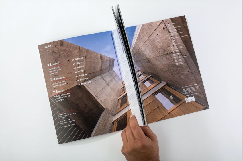
Designs and Images Courtesy of Maximo Escobedo except where noted.
When designer and UC San Diego Extension instructor Maximo Escobedo moved to the United States from Mexico at 15, he knew that despite his love of drawing, he was going to become an engineer. Both of his brothers studied engineering, and becoming what his parents called a "starving artist" was not an option. Then, during his second year of university, he stumbled across a course description for an introduction to graphic design class and it all clicked.
"I changed my major that day," he said. "But that was just the beginning, learning what graphic design was. After I graduated, I went up to Pasadena. I saw the portfolios of students at the Art Center College of Design. I knew I needed to learn not just about the technical side, but also the philosophy of design."
In Pasadena, Maximo learned how to think like a designer, looking for creative solutions to complex communication challenges.
"Fine art, art, design," he explained. "These are different in a fundamental way—as designers, we are not trying to express our own message, but communicate our client's message. We have to fight the urge to make it about ourselves."
That doesn't mean there isn't room for creative freedom in design. In fact, successful design requires it. "Our job is to get past the obvious solutions to create long-lasting, engaging, creative new ways of looking at something," Maximo said. "As you solve design problems for clients, you develop a recognizable voice and style of your own. There are even some star designers who are sought out specifically for their unique style, but they are the exception. For me, the greatest moment is when a client begins to look forward to seeing my new solutions."
.jpg)
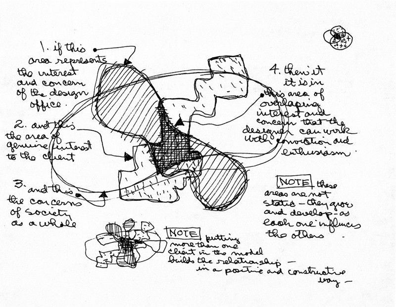
Diagram by Charles Eames. Displayed in the 1969 Exhibition Qu'est-ce Que Le Design? (What is Design?) at the
Musée des Arts Décoratifs in Paris, photograph. Prints & Photographs Division, Library of Congress (A-20)
Iconic 19th-century American designer Charles Eames created a diagram in 1969 to explain the role of design and the designer. The needs of the artist, the client, and society overlap, and great design happens at the point where these three needs intersect. In today's world, when desktop publishing, design apps, and filters put design tools in the hands of anyone with a computer or a smartphone, many are again questioning the role of design professionals.
"People were worried when desktop publishing came out, but it is not the technical software knowledge that we offer clients," he explained. "As professionals, we can provide custom solutions to unique design problems, and the result will not look like everyone else's, because it is not already pre-designed by a program, but created through a thoughtful approach that combines our technical training and artistic perspective."

Creating great design is a collaborative process between the client and designer. When the client is a publication, that can mean a team of people, from the author of a story to the editor in chief. When working at the Salk Institute as the designer of InsideSalk magazine, Maximo added scientists to his list of collaborators.
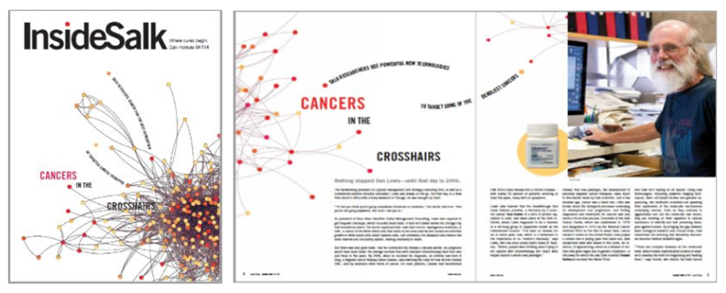 "Content is the idea and form is the design, so I wanted to make sure I understood the concepts well enough to represent them visually, and if they were open to it, I preferred to speak to the scientists themselves," Maximo explained. "In one particular design for a feature on cancer research, I found inspiration in the data charts that were sent over with the article. The clusters of information looked like a tumor in a subtle way; the data points felt organic. I wanted to use it, allowing some of the points to escape onto the clean white space. It created unexpected contrast and intrigue that drew people into the story."
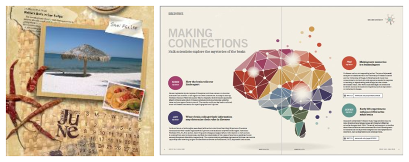
Some designs, like brand logos or a feature layout, should be interpretive and communicate a feeling, while others, like infographics, must communicate information in a visual way with precise accuracy. Whether abstract or exact, successful designs share one key quality. "The beauty of design is that the viewer won't always solve the problem right away, it comes to them in layers," Maximo said. "As a reader solves the problem, it makes it memorable. Like when someone asks, 'Did you see the arrow hidden in the FedEx logo? So clever! What about the fact that the smile in the Amazon logo points from 'a' to 'z'? Once a viewer has solved it, they will never forget it."
 Designing creative visual communication requires an artist's sensibility, coupled with training in design fundamentals. Playing with design elements such as scale, color, and the Gestalt Principles of grouping are just a few ways that artists can help their clients connect with their intended audience. Maximo teaches his students that scale can depend on context: objects can burst off an ordinary page in full bleed, or small isolated elements can draw importance from the vast white space surrounding it. Color can convey a mood, describe reality, or codify information, or can be used to make some things stand out, like warning signs, or to make other things disappear like camouflage, in order to connect, to highlight, and to hide.
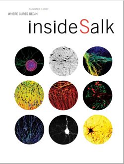 "In art school, I learned that symmetry was frowned upon. It was seen as too old fashioned. Asymmetry feels more organic, it suggests movement and action, and is often more surprising," Maximo explained. "We naturally turn to symmetry first because everything is built on an axis. Sometimes it is the right choice for a design when we want something to look more formal, for example, or when we don't want anything to distract from the imagery."
"One feature for Salk had these beautiful images, and I wanted to keep the focus fixed on them. The resulting design mimicked the feeling of looking through a microscope. I didn't need viewers searching for meaning in an asymmetrical design. I wanted them to look at those beautiful images."
"Another example was a 25th-anniversary book," he said. "Symmetry worked well on the cover as a way to convey a kind of formality, but once inside, I shifted to asymmetrical page layouts to keep the eye moving."

Good communication design doesn't end with visuals. "As designers, we have to go beyond the obvious," said Maximo, who has worked on projects ranging from product design to magazine design to interactive digital design.
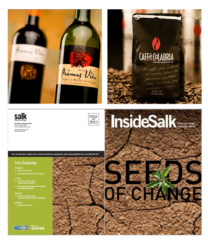 "I love to challenge expectations, add layers, add tactile experiences," he explained. "I see a magazine cover like a product box, the back is as important as the front, and I love to create and experience by adding texture." For the cover of the "Seeds of Change" issue of InsideSalk, Maximo used sandpaper to create a gritty finish on the cover image of dry earth.
"It is not about gratuitous design just to be different, but about creating new ways of engaging," he said. "Embossing and paper texture, it all gives an experience, not just with visual vocabulary."
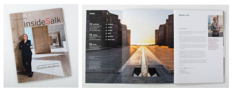 Sometimes, despite a designer's best efforts, clients will insist on changes that can make a design less effective. "All we can do is provide the best solutions possible to our clients, and the key is to present enough options that they feel ownership of the process. I try to guide them to what I see as the right choice, but I know going into it that my worst design still needs to be good enough because that might be the one they choose. There should always be a design brief that outlines the problem, the goal, the audience, and any other variables to help focus your efforts. If you follow the brief and the client pushes back, you can go back to it," Maximo said. "But, sometimes, you just have to let it go. There is always another design problem waiting to be solved."
Turn your creativity into a career with a certificate in Communication Design. Have questions? You can contact the department at ahl@ucsd.edu or leave a comment below.